Showing posts with label illustration. Show all posts

17 Jul 2013

Sky Arts Tv Portrait Festival; Dublin


I just got back from Dublin yesterday, I was selling my portrait work at the Sky Arts Portrait Artist of the Year Festival in the RDS. Much to my surprise I was contacted a while back by Sky Arts to sell my work at this event. The last two weeks was a bit of a mad rush to get everything printed, packaged and prepped, which was especially difficult given how glorious the weather has been. I made a lot of stock expecting a bigger crowd, but the sun was against us as most people stayed outdoors. It was still a lovely event and I got to meet some really amazing artists.


You might recognise a couple of the canvas bags from my Etsy shop or bookstall, but I really expanded my range for this festival. I did loads of new author paintings and also go the images printed onto 5x7" cards. I've started listing the cards already online, but as the week goes on I'll get around to listing everything else. I'm not really happy with the staging of the photos that I did for the cards, so I plan to re-do them this week, and make them more bookish. Also now that I have the original paintings mounted I think I will put them on sale too. Watch this space!

The main part of the event was artists competing on the day for national portrait artist of the year. As far as I could gather they have traveled around four different cities hosting these types of festivals, at each show the artists have four hours to paint a model. At the end of the day a winner is chosen, an overall winner is then chosen, with the prize being £10,000. It was amazing to see the artists work, especially under such a high pressure situation, I know I couldn't do it!


There were lots of events on throughout the day for people to take part in like life drawing classes, sculpture, face painting, and face reading. These graffiti artists were amazing to watch as the day went on.


As I said it was lovely to meet some great artists on the day. I have known Tanya online for a good while now but this was the first time I got to meet her in person, which was great. Tanya has a very successful Etsy shop and a big following on Facebook. Some friends of mine got some of her work at the weekend, and I think my nice would really like a piece for Christmas too.


I also met Shane O'Donoghue, we quite obviously have subject matters in common, but a really different take on them. I really liked the style of his work, it probably appeals to the printmaker in me. All of his designs are cut by hand first and then laser cut afterwards. I'm very tempted by these amazing bookends as a present for myself when I'm feeling a bit more flush. 


From Ruby Robin Boutique I met the lovely Kay and her super nice helper Sarah (??), they were like a beam of friendliness! I fell in love with all of their jewellery, and wanted to buy loads of it, but poor sales stopped me from indulging myself. But through the wonders of the internet I can drool over their lovely things online until I feel the need to spoil myself in the near future.

 I had also seen Jokamin's stuff online before, I think I stumbled across her stuff on Facebook. I love the style of her work, both the paintings and the ceramics. You can see how hard it was for me not to buy all the amazing stuff that was for sale.


How cool is this Zooey Deschanel print??? Again more things that tempted me into spending my rent money! Basically if anyone ever wanted to buy me a present I would have been happy with anything from any of the stall holders. (on a side note I must say I love her product photography, it's a good kick up the arse to step up my game when it comes to product staging).
Thanks for stopping by my blog!
Keep up to date on all my regular posts with my RSS Feed or follow me on Facebook, Twitter and Bloglovin'.
Pin It

3 Apr 2013

Roller Derby Design


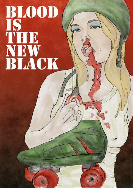
The Limerick Roller Girls are playing for the first time in their home town this weekend. I have a few friends and acquaintances on the team and they suggested that I sell my wares at the event. Instead of just turning up with my normal crafty stuff I thought I would design some derby t-shirts, canvas bags and badges. 

My first port of call was of coarse Pinterest, that's where all the crafty rockabilly girls hang out don't you know! Derby huge in America so there was loads to look through. Basically I was looking for striking photos  to base my illustrations on. I thought this girl was particularly kickass, so she was the first one that I worked on. So far I have done eight drawings, but this is the only one that I have finished in Photoshop. The event is on Saturday, so I really need to get my skates on, pardon the pun!

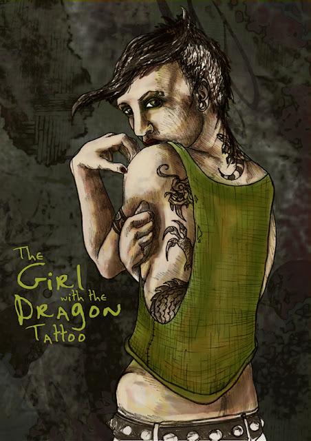
My intention was to go for a really muted palette, so I wouldn't distract from the line drawing too much, but I got a bit carried away at the end. As you saw in my Girl With The Dragon Tattoo piece I have tendencies to change my mind after a while(the joy of working in Photoshop is that is gives you that freedom that traditional illustration doesn't). I've been looking at the work of my friend Jordie Bellaire a lot, and trying to figure out a few tricks. She is an amazing colourist, looking at her work I discovered that a palette can really make or break a piece. She has been good enough to give me advice in the past(I went to college with her boyfriend Declan Shalvey) and I really appreciate how honest she has been. Colour wasn't something I paid a lot of attention to in college, and I feel like I'm only trying to figure it out now. I'm always tempted to go for really strong colours, but it's good to use some of the other tools in the box too.


The match is on this Saturday in UL, for full details go to their event here on Facebook, tickets are €10 with concessions for students and OAPs, and it's free for kids under 5. You can also go to their website to purchase tickets.

Note: Even though I will be selling at this event on Saturday my book stall will still be open for it's normal hours. 


Thanks for stopping by my blog!
Keep up to date on all my regular posts with my RSS Feed or follow me on Facebook, Twitter and Bloglovin'.
Pin It

6 Nov 2012

Fashion Illustration Calender


Original outfit image here.

Ideas for new products come from lots of different places, sometimes it's seeing a tutorial, sometimes discovering a new material, and others it's chatting with friends. I was at my stall the other day and talking with fellow trader Mairead who sells beautiful home and gift ware called The Gift Store (great for house warming presents!). She sells a range of cards, prints and calenders, and we were talking about different illustrators, their styles and their range of products. Having seen my illustrated cards she encouraged me to do a calender, knowing that it would be very different to what she stocks at her stall. It was something that I've had in the back of my head for ages, but never got around to doing. 


Original outfit post here.

So I went home on Sunday and did a few sketches, I liked the idea of doing a fashion illustration one, with the clothes changing to match the Seasons. I did two pieces that evening. I wasn't really sure what style I would work in, but I just followed where the drawing brought me and stumbled upon using a monochrome palette with one popping colour. The idea is that each month will have it's own colour, with the most eye catching piece of clothing in the picture. I trawled through Pinterest and online for distinctive fashion photos to base the illustrations on, I've been looking at magazines, blog posts, street style; anything that pops out. I'm looking forward to doing more pieces, but I'd say it will take me a while to do all 12, lets just hope I have it finished on time for Christmas.

Mairead's stall The Gift Store

Thanks for stopping by my blog!
Keep up to date on all my regular posts with my RSS Feed or follow me on Facebook and Twitter
Pin It

3 Sept 2012

Revised Girl With The Dragon Tattoo Drawing


Do you remember this image that I did a while back as a canvas bag design? After about a week of looking at it I was really unhappy, it was way too busy, and I didn't like all the shading that I did on the original line drawing. I posted an evolution of the drawing that you can see here, and even when I originally posted it I preferred the simple drawing. I asked two friends of mine Declan Shalvey, an award winning comic book artist, and his partner master colourist Jordie Bellaire for some constructive feedback; they were really good to give me some helpful pointers. I put the piece on the shelf for a few months but last night I decided to go back to it after I was inspired by a book I was listening to*.


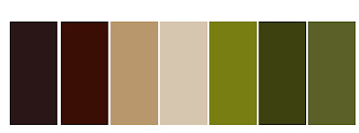
I liked the texture that I had developed in the hair and vest in the second stage of shading, so I just placed one layer on top of the other in Photoshop and erased the shading on the skin. Immediately I could see an improvement. I also made a colour palette to try to simplify my image, I used the original image as a starting point. I read Jordie's blog a lot and I've been trying to pick up some trade secrets, she does lots of palettes from films that she likes and then uses these to colour work. After making the palette above I was not too thrilled with the colours so I did some playing around and came up with the one below, I'm new to this so I was kind stumbling about a bit.

I added shape and contour with large shapes of colour, which kinda reminded me of the lino cutting process I used to do in college. This has the advantage of leaving the delicate black line still very visible.


I like this stage I felt she looked too much like a zombie with the blue flesh tone, I don't think I'm confident enough yet to use such bold colour with much skill. You'll also notice I changed the colour of the vest to try to tie in the background more and introduced this as an eye shadow colour too.


I went back to the original green image and pulled out some of the skin tone layers, removing all the complicated brush ones and played around with the existing blue layers. The result is more subtle than the zombie version, and more delicate than the scratchy green image. I'm much happier with this version that the over-reaching mess of the first attempt. I'm really happy that I saved all my stages so I was able to revisit this piece. I will have this new revised canvas bag on the stall from this weekend.


So be honest, which do you prefer?


Update: After reading the really constructive advice from Declan in the comments below I reassessed my last minute wimp out from the blue skin. I went back to the image again(wouldn't Stephen King be so proud after all his advice for going with my gut and taking on difficult rewrites!) and brought it back to the blue. I also tweaked the background too, pushing the right side back into darkness and brightening the left side.

I really value critiques, they can be hard to give, especially to friends. Declan was always great for this in college, people sometimes thought he was brutal, but I thought it was more constructive that someone expected more from me and didn't accept the first result.

 *For the past week I've been listening to On Writing by Stephen King, which is a hybrid autobiography and a manual for aspiring writers. I listened to it because I'm an avid Stephen King listener(all his book that I read are audio) and I love his book introductions which give a window into his life and process. Even though I enjoy writing as a hobby for this blog most of what he was talking about applied to the artistic process too. There was one particular passage that talked about leaving a book in the drawer to brew for a few weeks that reminded me of this drawing, and how I might be better equipped to view it with unlazy eyes.


Thanks for stopping by my blog!
Keep up to date on all my regular posts with my RSS Feed or follow me on Facebook and Twitter
Pin It

22 May 2012

Illustrated Cards


I had a bit of a revelation last week, after years of making cards for the first time I made entirely printed cards. It seems insane that I never did it before, I saw other people doing it but never made the connection in my brain to do it myself, which is silly considering how much I like drawing. I think it was all the drawings I've been doing for the canvas bags that spurred on the idea.

I did a bunch of pencil sketches, I have a graphic pad but nothing beats drawing on paper with a pencil. I then scanned them in and set about colouring in the drawings. (To do this in Photoshop go to layer options for your drawing layer, in the drop down menu choose multiply. This makes the layer see through so all you can see is the drawing but not the white, make a new layer behind this and colour on this layer, it's like using sheets of ascetate). I chose to put them on a sparing white background and let the drawings speak for themselves. I may experiment with other layouts down the line, but at the moment I like this aesthetic.

I had tonnes of 5x5" blank cards left over from Christmas, and I brought these to the printer but he was unable to use them. Instead he printed on card and I folded them myself afterwards. I was able to use the envelopes from these packs. Down the line I'll have to source envelopes to make it more cost effective than buying card packs just for the envelopes.

I found at the stall some people were really put off by a €4 price tag for a handmade card so that's why these printed cards are great, I'm charging €2.50 each or 5 for €10. I'll also list them in my Etsy shop as they can be reproduced easily so it's worth the effort to take photos and write listings for them. I'll also be making a range of As Gaeilge cards too, as the collaged ones have been incredibly popular.

To see the whole collection so far just head over to this Facebook album.


Did you find this post helpful or interesting? To follow my other post here is my RSS feed.


Pin It

26 Apr 2012

The Girl With The Dragon Tattoo Drawing Evolution

 Here is another design that I've been working on for my series of canvas bags. Since I thought of the idea of making bags a couple of weeks ago I knew I wanted to do my own Lisbeth Salander( The Girl with the Dragon Tattoo). I enjoyed posting last weeks evolution of Frankenstein's Monster so I thought I would do the same for this.

Initially I drew the line drawing in pencil and scanned it in before shading it in with graphite pencil. The third image shows the two of these images put together in Photoshop, making the outline darker. Fir this project all colouring is done on the computer, similar to the way to the way the a lot of comic book artists work. I added layers of colour using textured brushed, building up an interesting background. I wanted to go for a ruddy and army green palette rather that the expected grey and black.

I'm happy with the result, but the purest draftsman in me kinda prefers the simple line drawing. I learned this from the work that I did last week, that's why I scanned in the image after this first stage. I might go back and do another more simplistic version, as a learning exercise, to see what result I get. Having said that, I'm still drawn to the final image, I like the colours and textures that I was able to get in the background.

What do you think?

Update: After a few hours I went back and played with the colours a bit. I think I liked the background too much to allow myself to see that it was making the piece too busy. I knocked back the saturation and made it much more monochromatic, meaning that Lisbeth pops out more.


Did you find this post helpful or interesting? To follow my other post here is my RSS feed.


Pin It

24 Apr 2012

Juxtapoz Illustration Book


Since I've been doing some drawing again recently I started paging through my collection of illustration books. I built up my modest library mostly getting them as presents, or buying good art books when visiting galleries or good bookshops when I'm away. I bought Juxtapoz Illustration when I was away in London a few years ago, Juxtapoz is an art and illustration magazine and this a compilation book. The sticker on the back says I paid £20 for it, an alright price for a hard back book. I picked out a few of the more interesting artists in the book...

(I found the book here on Amazon if you are interested)
Tomer Hanuka is a New York based illustrator. I love his use of line and block flat colours, this piece particularly reminds me of Aubrey Beardsley's work, who I was a little obsessed with in college.


Mode2 is a graffiti artist based in London, this piece is much more classical that the rest of his work, but it reminded me of years of travelling on buses and train to visit my parents; all these tiny special moments that you get to see of other peoples lives. I love people watching, and have drawn a few passengers in my time, I love this piece. 


I just had a look at Morning Breath Inc's website and his work seems really varied, he has done design work for the Foo Fighters and Slayer, but I must say that I prefer this style of work. I like the layering of text, flat colours with a defined line drawing on top, it appeals to the print maker in me. 


I love these collages by Eduardo Recife. I got big into collage in college, which is probably why I love card making so much. A friend of mine reminded me of a present I made for him years ago of a collage that I scanned in, transferred and made into a cushion. I had totally forgotten about it, but it sounds like it would be fun to do this kind of thing for the canvas bags.


Did you find this post helpful or interesting? To follow my other post here is my RSS feed.


Pin It
Related Posts Plugin for WordPress, Blogger...