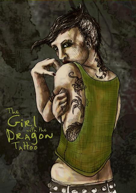

Do you remember this image that I did a while back as a canvas bag design? After about a week of looking at it I was really unhappy, it was way too busy, and I didn't like all the shading that I did on the original line drawing. I posted an evolution of the drawing that
you can see here, and even when I originally posted it I preferred the simple drawing. I asked two friends of mine
Declan Shalvey, an award winning comic book artist, and his partner master colourist
Jordie Bellaire for some constructive feedback; they were really good to give me some helpful pointers. I put the piece on the shelf for a few months but last night I decided to go back to it after I was inspired by a book I was listening to*.

I liked the texture that I had developed in the hair and vest in the second stage of shading, so I just placed one layer on top of the other in Photoshop and erased the shading on the skin. Immediately I could see an improvement. I also made a colour palette to try to simplify my image, I used the original image as a starting point. I read
Jordie's blog a lot and I've been trying to pick up some trade secrets, she does lots of palettes from films that she likes and then uses these to colour work. After making the palette above I was not too thrilled with the colours so I did some playing around and came up with the one below, I'm new to this so I was kind stumbling about a bit.
I added shape and contour with large shapes of colour, which kinda reminded me of the lino cutting process I used to do in college. This has the advantage of leaving the delicate black line still very visible.
I like this stage I felt she looked too much like a zombie with the blue flesh tone, I don't think I'm confident enough yet to use such bold colour with much skill. You'll also notice I changed the colour of the vest to try to tie in the background more and introduced this as an eye shadow colour too.
I went back to the original green image and pulled out some of the skin tone layers, removing all the complicated brush ones and played around with the existing blue layers. The result is more subtle than the zombie version, and more delicate than the scratchy green image. I'm much happier with this version that the over-reaching mess of the first attempt. I'm really happy that I saved all my stages so I was able to revisit this piece. I will have this new revised canvas bag on the stall from this weekend.
So be honest, which do you prefer?
Update: After reading the really constructive advice from Declan in the comments below I reassessed my last minute wimp out from the blue skin. I went back to the image again(wouldn't Stephen King be so proud after all his advice for going with my gut and taking on difficult rewrites!) and brought it back to the blue. I also tweaked the background too, pushing the right side back into darkness and brightening the left side.
I really value critiques, they can be hard to give, especially to friends. Declan was always great for this in college, people sometimes thought he was brutal, but I thought it was more constructive that someone expected more from me and didn't accept the first result.
*For the past week I've been listening to
On Writing by Stephen King, which is a hybrid autobiography and a manual for aspiring writers. I listened to it because I'm an avid Stephen King listener(all his book that I read are audio) and I love his book introductions which give a window into his life and process. Even though I enjoy writing as a hobby for this blog most of what he was talking about applied to the artistic process too. There was one particular passage that talked about leaving a book in the drawer to brew for a few weeks that reminded me of this drawing, and how I might be better equipped to view it with unlazy eyes.

Thanks for stopping by my blog!
Keep up to date on all my regular posts with my RSS Feed or follow me on Facebook and Twitter
|
Pin It


